Our thanks to Abigail Cohen, Senior Associate, Policy and Advocacy, at Data Quality Campaign (DQC). Abigail shared with us DQC’s third annual, “Show Me the Data” report, which takes a close look at state report cards and details how meaningful, accessible, and understandable they are for families and communities.
Key Takeaways
- This is the first year of new data collection and disaggregation requirements under the federal Every Student Succeeds Act (ESSA). States are required to collect new information on topics such as student discipline and school spending, and must also disaggregate data for specific subgroups – including students in foster care, students who are homeless, and students who are military connected. State leaders may consider including some of this data on state report cards.
- ESSA also requires that state report cards be presented in a language that parents can understand. While more states are working to ensure that information on report cards is easily understood by parents, most text included on report cards uses language and sentence structure that align with college-level reading, and only 15 states translate the report cards into a language other than English.

- New this year, DQC also examined how states are approaching the design of their report cards since the majority are online. DQC shared three specific approaches: one-stop shop, parent-facing front door and data hub. If done well, each approach allows the reader to better understand the complex information in a way that’s not overwhelming.
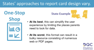
- One-Stop Shop: This is presented as an all-inclusive resource where all data lives in one place. This simplifies the user’s experience, but might not be as effective if the state presents data in a lengthy PDF or long web pages that require the user to scroll continuously. Abigail noted the Louisiana school report card as a great example of a one-stop shop report card.
- Parent-Facing Front Door: This approach tends to be used in states with robust data systems. Instead of directing the user directly to this data system, states create a landing page, or “front door,” that’s easier to navigate and includes high-level information on key indicators. When used well, this approach gives the user a quick overview of the most important information, however, states should be mindful about making the information too simple. Check out the Massachusetts report card for a good example of a parent-facing front door.
- Data Hub: This approach communicates a huge variety of information, allowing the parent or user to have access to all data, not just the data the state believes its readers want. Of course, too much data can quickly become overwhelming if not presented in an organized way. Abigail highlighted Michigan’s state report card as one that presents a great data hub approach.
- Many states have made progress in improving the usability of their report cards, but there is still room for improvement in order to ensure that parents and families can use information on state report cards in meaningful ways. States should consider providing context to the data presented and include questions and action steps for parents based on the data for a specific school.
For our full conversation with Abigail, please watch the webinar below:

Our next Intersection webinar is April 24 at 1 p.m. ET. Linda Smith, director of the early childhood initiative at the Bipartisan Policy Center, will review their latest report “Creating an Integrated Efficient Early Care and Education System to Support Children and Families: A State-by-State Analysis.”
Stay tuned and follow us on Twitter for details on upcoming webinars.
See you at the Intersection,
The Hunt Team


